| Entrance | Mainstreet | Wiki | Register |
|
# of watchers: 7
|
Fans: 0
| D20: 10 |
| Wiki-page rating |  Stumble! Stumble! |
| Informative: | 0 |
| Artistic: | 0 |
| Funny-rating: | 0 |
| Friendly: | 0 |


[Phoenix Tears]: so Scott says the first one
[Phoenix Tears]: and Tom says the second one
[Phoenix Tears]: gosh don't know which to choose
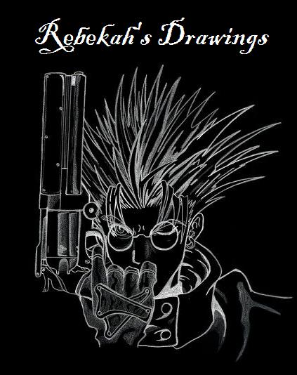
[SkorpionDruid]: I think I can tell you why it's hard to tell which one to use.... it's because the darker shadow looks good, but it is much to sharp of a contrast with the hair. It makes it look thrown on. Perhaps you could shade the hair a little darker on the right side, and it would match the shadow better, and lessen the extreme contrast. Oh and maybe shade some of the other shadows darker. Like where the arm is.
[SkorpionDruid]: oh, and btw, I love the drawing, its fabulous! I can never NEVER get the "looking down" perspective. You did a wonderful job though!
[Phoenix Tears]: yeah, that's exactly what i was thinking as to why i can't seem to choose....good idea....but, see, I never, absolutely NEVER touch a drawing once I've officially "Finished" it, if you understand that....I dunno, we'll see though....I may yet
[Phoenix Tears]: hee *blushes* thanks so much! I was worried that ppl might not be able to see the "looking down" perspective, but hey, I guess I was wrong! Yay! Thanks!
[SkorpionDruid]: heh, I know what you mean about not touching the finished drawing. I'm like that sometimes. If that's the case I'd choose the first one, because even though the contrast isn't as good it has better blend.
[the crazed artist]: first one...in the second one, the darker shadow sraws the attention away from the actual subject of the pic...
Number of comments: 29 | Show these comments on your site |
|
Elftown - Wiki, forums, community and friendship.
|